Group A
 Mexico
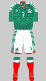
1st
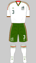
2nd
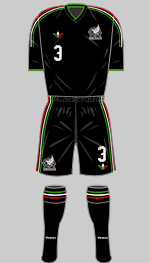
3rd
Designer: Adidas
Mexico's Tiro 26 first choice kit harks back to 1998 with a stunning Aztec inspired motif while the alternative is more restrained and features the revived trefoil logo. The third kit was produced in collaboration with Someone Somewhere, a social enterprise that supports Mexican artisans and the communities they work in.
As one of the three co-hosts, Mexico play all of their group matches within their own country.
 South Africa
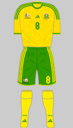
1st
2nd
Designer: Adidas
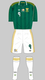
Bafana Bafana have also opted for the Tiro 26 design which incorporates a tonal graphic consisting of diagonal lines arranged in a diamond shapes that is supposed to evoke the linguistic diversity of the country. Seems like a bit of a stretch to me. The change kit is in dark green with yellow ochre trim, colours more usually associated with the Springboks rugby team. The tonal graphic appears again within the lighter stripes of the shirt.
 South Korea
1st
2nd
Designer: Nike
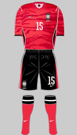
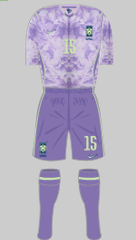
The Tigers of Asia have, fittingly enough, added a tiger print motif to their Global Red shirts, now teamed with black shorts. This being Nike, some purple prose is called for and we learn that the design is "inspired by the idea of a tiger ambush - a mindset rooted in surprise, precision and collective strength." The alternative is in "Space Purple" with pale lime green trimmings and represents an abstract floral pattern. Both strips are in Nike's latest template which features piping that flows from the shoulder seam down the back and curves to the side of the shirt.
 Czech Republic
1st
2nd
Designer: Puma
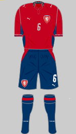
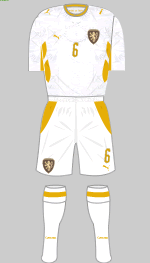
Puma's new template has a pair of diagonal blobs running upwards from the armpit. Not their finest hour I think. First choice is in deep red with dark blue shorts and socks and silver detailing. It's supposed to be a tribute to their 1996 outfit which they wore when they finished as runners up in the Euros. The resemblance is not immediately obvious. The change strip is altogether more interesting as it features a sublimated pattern based on traditional Bohemian crystal, with dark gold detailing.
Group B
 Canada
1st
2nd
3rd
Designer: Nike
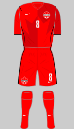
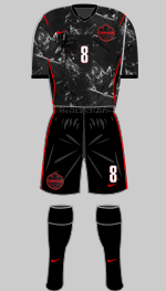
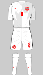
Canada's kits have to feature the maple leaf and their first choice shirts have this in a bold half-and-half design on the front of the shirt. Nike's latest detailing is present in black. The change strip really is stunning. The black base colour is punctuated by what appears to be a random, heavily distressed white graphic. On close inspection this turns out to be maple leaf patterns rendered in cracked ice. Whoever came up with this concept deserves their bonus. There is little justification for a third strip except that it complies with FIFA's requirement for high contrast kits.
 Bosnia & Herzegovina
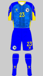
1st
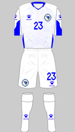
2nd
Designer: Kelme
Bosnia & Herzegovina are appearing in the World Cup finals for the second time having previously qualified in 2014. They came via the European play-offs after eliminating Wales and Italy in away games after penalty shoot-outs. They demonstrated that they can defend doggedly and also dominate play against supposedly superior opponents (they are ranked 65th in the world). The long expected new kits were revealed in May and are rather disappointing when compared to the outfits they have replaced.
 Qatar
Qatar
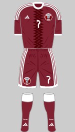
1st
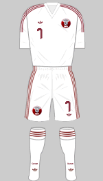
2nd
Designer: Adidas
After their dismal showing in their own World Cup four years ago, Qatar's appearance in 2026 shows how the expanded format has allowed sub-standard teams to reach the finals. They play in their usual all-maroon colours with a zig-zag motif taken from their national flag. The white alternative is just a plain old Adidas strip out of the catalogue. Even their nickname is disappointing - the Maroon One.
 Switzerland
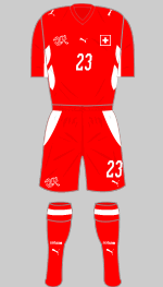
1st
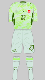
2nd
Designer: Puma
Although Switzerland have yet to trouble the later stages of the Euros or the World Cup, they generally manage to qualify and in recent years they have pulled off some notable results and are currently ranked 19th by FIFA. They play in the national colours of red and white but this time round they have broken with tradition by introducing a flamboyant second choice strip in pale blue/grey with abstract neon green patterning on the shirt that is supposed to evoke the coutry's mountainous terrain.
Group C
 Brazil
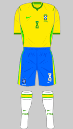
1st
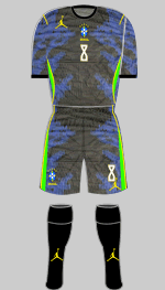
2nd
Designer: Nike
There's a lot to like in the Seleção's latest outfits. The first choice shirt is the proper shade of Canary Yellow while the shorts are the bright blue we saw in the Pelé era. An additional splash of light green is added alongside the traditional shade to create an elegant grace note so 10/10 for that one. Turning to the alternative we have a real head turner in black and royal blue with neon green trim. The apparently random pattern is in fact based on the skin markings of the poison dart frog. I can confidently state that this is the first time that a football kit design has been inspired by an amphibian. This strip carries the Jordan "Jumpman" logo, a brand that is a partnership between Nike and the basketball player, Michael Jordan.
 Morocco
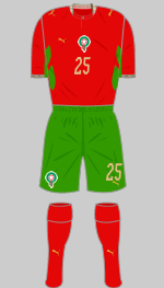
1st
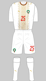
2nd
Designer: Puma
Morocco and Senegal have been embroiled in a furious dispute following the chaotic Africa Cup of Nations final in January when the Senegalese walked off following a controversial penalty decision but went on to win in extra time. Initially the Confederation of African Football (CAF) levied fines amounting to over $1 million but allowed the result to stand. Two months later CAF reversed their decision and awarded the trophy to Morocco, a decision that has been referred to the Court for Arbitration in Sport who have made it known their decision will not be announced until after the World Cup.
Controversy notwithstanding,
Puma have delivered two excellent strips. The first choice is in the national colours with traditional patterns printed into the collar and cuffs. This is taken further on the white alternative which has an exquisite pattern in pale gold inspired by traditional Moroccan Zellige tilework.
 Haiti
Haiti
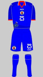
1st
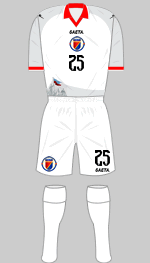
2nd
3rd
Designer: Saeta
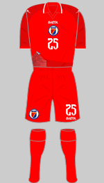
Because of the dreadful political and security crisis, Haiti had to play all their "home" games in neutral countries. The fact that they quaified for the finals directly for the first time since 1974 is a remarkable achievement. The Colombian supplier, Saeta, has delivered three kits in identical templates. The key detail is a graphic in the bottom right of the shirt which shows the heroes of Haiti's revolution raising the flag of independence in 1804. On the eve of the tournament FIFA decreed that this broke their regulations on political content and replacement jerseys without the iconography were hastily ordered.
Haiti is subject to the travel embargo so the only Haitians who can attend matches, aside from officials, are those legally settled in the United States.
 Scotland
1st
2nd
Designer: Adidas
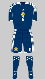
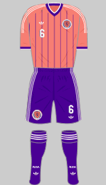
Given that Scotland have not reached the World Cup finals since 1998 you would think Adidas would have made a bit more of an effort with the first choice kit. There is a tonal pattern based on the cross of St. Andrews embossed into the shirts which qualifies them as bespoke but this feature is invisible at a distance. Furthermore, many supporters prefer their team to play in white shorts and have at least some red in the socks and I agree with them. I'm filing this one under "bland". The change strip takes us back to the 90's when salmon pink and purple seemed a brave choice. Adidas' version is rather more restrained than the Umbro kit of that period but I suppose we are all older and wiser now.
Group D
 United States
1st
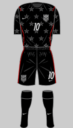
2nd
Designer: Nike
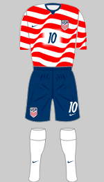
Nike are the archetypal American sports leisure brand and have been supplying kits to the USMNT since 1995. They have looked for inspiration to 1994, when the United States hosted the World Cup for the first time. Ironicaly those kits were provided by Adidas. The first choice jersey evokes the American flag blowing in the wind and is likely to be a best seller. Adidas' change shirt in 1994 had an innovative denim effect into which were printed large white stars. Nike have turned that idea on its head with a striking all-over dark obsidian strip with red piping, silver highlights and tonal stars woven into the fabric. And there we have it ladies and gentlemen - stars and stripes.
 Paraguay
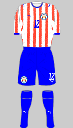
1st
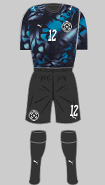
2nd
Designer: Puma
Paraguay always, always, always play in red and white stripes matched with blue shorts and over the years designers have tried to come up with novel twists to keep things fresh. Unfortunately I think Puma have not risen to the challenge here. The distressed stripes look scruffy to my eye and the new side panels break things up to no good effect. On the other hand the halliucinogenic change kit is very striking.
This the first time in 16 years that La Albirroja have appeared in the World Cup finals.
 Australia
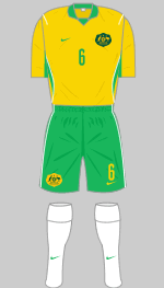
1st
2nd
Designer: Nike
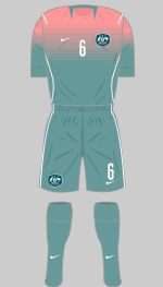
The Socceroos have appeared in the finals of every World Cup since 2006, the year they joined the Asian Football Confederation. Having adopted a quite startling design from First Nation Artist, Reko Rennie, last year they have reverted to a more traditional look for this tournament. I find the combination of gold, green and white deeply satisfying. There is a subtle fade effect on the shorts with the green getting darker as we travel south. The change strip is a rather different matter, with a shirt that grades from coral pink to teal. This may not be one for the purists but it is certainly original.
 Türkiye
1st
2nd
Designer: Nike
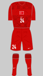
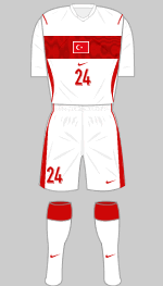
Türkiye are making their first appearance in the finals since 2002 when they finished in third place. They arrived here through the European play-offs by beating Romania and Kosovo. Their main strip is in deep red with a flowing tonal graphic printed into the front of the shirt. This is interrupted by a solid deep red band upon which the national flag is placed. The alternative is white with a red band and trim. They are known as Ay-Yıldızlılar (The Crescent Stars) and Bizim Çocuklar (Our Children, which is sweet).
Group E
 Germany
1st
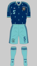
2nd
Designer: Adidas
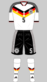
Die Mannschaft may have disappointed since they last won the World Cup in 2014 but they can never be written off. Adidas and their subsidiary, Erima, have supplied their kit since 1971 but next year Nike will take over the contract having offered the Deutscher Fußball-Bund a mountain of cash that Adidas was not prepared to match. It's therefore fitting that the German company should produce two of the best outfits to grace this tournament as their farewell. The first kit shows just how good Tiro 26 can look when a bit of imagination is applied, in this case the inclusion of a chevron in the colours of the German flag, a reference to some of the iconic jerseys worn in the 90s. The change strip in navy blue and mint is entirely original and shows a lot of attention to detail.
 Curaçao
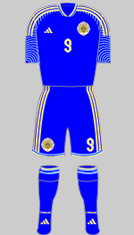
1st
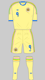
2nd
Designer: Adidas
The Caribbean nation of Curaçao is a constituent country of the Kingdom of the Netherlands, consisting of several island territories, previously the colony of Netherlands Antilles. They are the smallest nation by size and population ever to have qualified for the World Cup finals. They topped their qualifying group after drawing 0-0 with Jamaica in their final game in November 2025. Adidas' policy is that finalists should have bespoke kits and the process of designing and producing these to replace the Teamwear kits worn in the qualifiers apparently takes six months. The pale, creamy yellow change strip features vibrant, multi-coured trim that represents the brightly painted architecture of the country's urban landscape. The blue strip was revealed in late May.
 Côte d'Ivoire
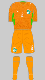
1st
2nd
Designer: Puma
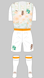
Les Éléphants have won the Africa Cup of Nations three times (the stars above the crest were removed at the behest of FIFA) and are appearing in the World Cup finals for the fourth time. They qualified directly after finishing top of their group. Their first kit is, as usual all-orange with green trim and white detailing. The body has an overall blotchy print that supposedly draws on traditional textiles and symbols but I don't see it. The away shirt is far more successful in celebrating Ivoirian culture with sun bursts, coconut palms and banana trees printed into the fabric in muted orange and green tones. This is one of the outstanding strips of the tournament.
 Ecuador
1st
2nd
3rd
Designer: Marathon
The CONMEBAL qualifying competition is different to that of the other confederations. The ten member nations play each on a round robin basis home and away. The top six qualify for the finals and the seventh team goes into the intercontinental play-offs. Ecuador finished in second place despite having three points deducted for using false documents for Byron Castillo in the last World Cup.
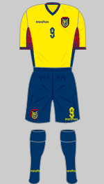
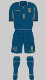
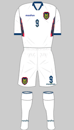
At first glance La Tricolor's yellow and dark blue strip is deceptively simple but there is a wealth of detailing hidden in the trim. The alternative is also strong on subtlety. The base colour of slate grey is set off with copper detailing and applications. The white third strip is enlivened by a multicoloured patch on the side of the jersey. Although they have been regarded as one of South America's weaker teams, in recent years they have achieved some excellent results including victory over Argentina in their final qualifier.
Group F
 Netherlands
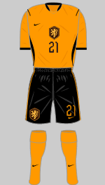
1st
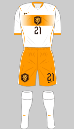
2nd
Designer: Nike
Het Oranje have a strong record in the World Cup having appeared in the finals eleven times and in the final itself three times but they have yet to win the competition. They finished top of their qualifying group with 20 points out of a possible 24. There are no gimmicks in their orange and black strip in Nike's latest template although the orange is a rather deeper shade than we are used to while the white alternative shirt features a fading band across the chest which looks rather nice. The shorts may be interchanged between the strips if needed.
 Japan
Japan
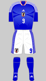
1st
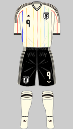
2nd
Designer: Adidas
There is usually something eye-catching in the Samurai Blue's traditional royal blue and white kit and this is no exception. The Tiro 26 outfit is enhanced with a subtle pale blue graphic that curves away from the national crest, drawing in the eye. The change strip is in off-white with fading pinstripes that represent the eleven players on the field. The red central stripe represents the supporters. To my mind the mutlicoloured stripes suggest diversity and multiculturalism, things that Japan is not noted for, but I am probably looking at this with Eurocentric eyes. It is, nonetheless one of the best kits of the competition.
 Sweden
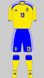
1st
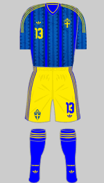
2nd
Designer: Adidas
Sweden arrive in the finals via the European play-offs where they beat Poland in the final with a goal in the 89th minute. This must have given them much satisfaction as they lost to Poland four years ago at the same stage. Sweden give us another variation on Tiro 26 but the choice of white rather than yellow trim seems odd. The shirt has a floral pattern printed into the fabris that is invisible from a distance and is apparently inspired by Abba. The change strip was debuted against Ukraine in the play-offs but was worn with blue shorts because Ukraine played in all-yellow. The shirt has an elaborate pattern printed into the vertical stripes.
 Tunisia
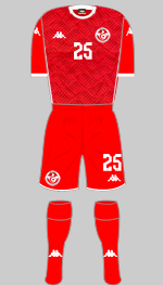
1st
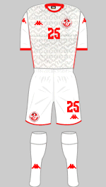
2nd
3rd
Designer: Kappa
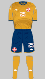
Tunisia are the first team in history to have qualified without conceding a goal and are in the finals for the third successive time. Normally all-red is first choice with white in reserve but this time out the colours have been switched around. The pattern on the sleeves and shoulders represent eagle feathers and draws on the team's nickname, The Eagles of Carthage.
Group G
 Belgium
1st
2nd
Designer: Adidas
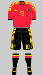
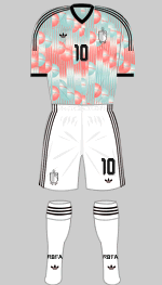
The Red Devils wear their tradtional colours as first choice with a graphic that combines tulips and flames to achieve the desired level of bespokeness and cultural relevance. Clever that. The change strip plays with the heritage of the Belgian Surrealist movement (Magritte, Delvaux, Nougé et al) in pale blue, light pink and carbon. I think this one is a lot of fun. Ranked ninth in the World, Belgium's best performance in the World Cup came in 2018 when they finished third.
 Egypt
Egypt
1st
2nd
Designer: Puma
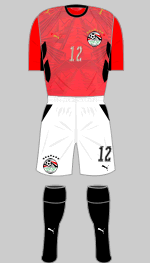
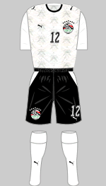
There were seven stars above Egypt's crest denoting the fact that they have won the Africa Cup of Nations a record seven times the last being back-to-back titles in 2006, 2008 and 2010 but these were removed on FIFA's instructions because only stars denoting World Cup wins are permitted here. Times have been leaner since then but they finished fourth in the 2025 tournament. Known as The Pharoahs their kits generally feature iconography from Ancient Egypt and this time round is no exception. The red shirts of the first kit features a pyramid exuding waves of power in every direction. The white change shirt also features smaller pyramids in a repeated pattern. The shorts and socks of the alternative strip have not been confirmed but will almost certainly be as shown. Given the cost of authentic replicas I dare say the soukhs of Egypt's cities will be doing a roaring trade in cheap knock-offs.
 Iran
Iran
1st
2nd
Designer: Majid
Following the unprovoked attack by the United States and Israel on 28 February it was far from clear whether the Iran would participate in the finals. A request to move their fixtures to Mexico was refused by FIFA and while Infantino insisted that, "Everything's fine" the US President went on record as saying that Iran's team should not travel to the tournament "for their own life and safety."
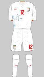
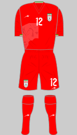
The kits were launched shortly after the Iranian Football Federation confirmed the team would indeed attend the finals, and are typically austere but enlived by an image of the Asian cheetah printed into the shirt and a tonal animal spot pattern on the sleeves. They are produced by the local sportswear company, Majid.
 New Zealand
1st
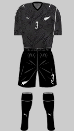
2nd
Designer: Puma
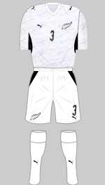
Thanks to the expanded format, Oceania is now quaranteed one place in the World Cup finals. Since the other teams in this confederation are, let us say, a little weak, New Zealand can expect to sail through as they did this time, scoring 29 goals and conceding just one in their five qualifying matches. Their white strip is adorned with a swirling pattern in light silver inspired by Ngā Hau e Whā, the Four Winds in Maori. The black alternative also has a jacquard pattern printed into the fabric with the traditional fern being the motif. The Maori word Aotearoa, meaning The Land of the Long White Cloud is printed below the back of the collar, this being the indigenous name for New Zealand.
Group H
 Spain
Spain
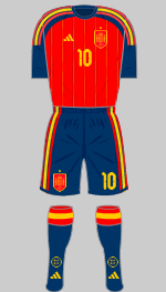
1st
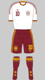
2nd
Designer: Adidas
The European champions are currently ranked second in the world. Unbeaten in their qualifiers, La Roja will be brimming with confidence. Adidas have delivered a classic first kit in their latest template that features broken pinstripes on the body in gold and dark red. The alternative looks very elegant in off-white and maroon with gold trimmings. The shirt features delicate spiral patterns printed into the fabric (unfortunately invisible at the scale of these graphics) that represent the elaborate decoration that can be found in medieval Spanish manuscripts.
 Cabo Verde
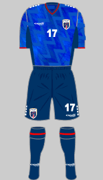
1st
2nd
3rd
Designer: Capelli Sports
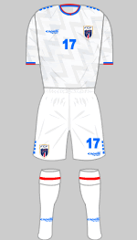
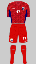
Cabo Verde is an archipelago of ten volcanic islands located some 350 miles off the west coast of Africa in the mid-Atlantic. With a population of less than 500,000 it is one of the least populous countries in Africa. Most of the team play outside the islands and several were borne overseas, part of the large Cabo Verdean diaspora which outnumbers the population of the islands. Many live in the US so the team can expect strong support. They qualified directly for the finals having topped their qualifying group with 23 points, four more than second placed Cameroon, and are making their debut in the tournament. Their kits are supplied by a New York sportswear manufacturer and feature an elaborate graphic that represents the flight paths that connect the nation's islands.
 Saudi Arabia
1st
2nd
Designer: Adidas
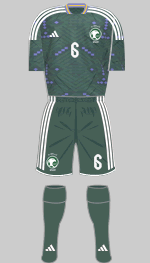
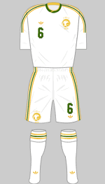
Thanks largely to Gianni Infantino bending FIFA's rules, Saudi Arabia has been selected to host the 2034 World Cup unopposed. Over the last 20 years the teams ranking has slipped from 21st to 61st but this has not stopped the Saudis from investing heavily in football around the world, largely to improve their poor reputation on human rights. Traditionally they wear all-green as first choice with white as the alternative. For this tournament the green is quite a dark shade and is embellished wih a symmetrical, abstract graphic with purple diamonds. The white strip has dark green and pale gold trim which looks rather good.
 Uruguay
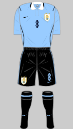
1st
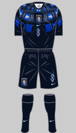
2nd
Designer: Nike
Uruguay seem to be starting the celebration of their triumph in the first ever World Cup final four years early. Not only is the first choice kit a passable imitation of the outfits worn in 1930 (if we ignore Nike's signature piping and the factNike have substituted very dark blue for the normally black shorts, socks and trim). The change strip is also an oblique reference to the match in 1930. The striking, reflective patterns on the shirt are inspired by the sweeping architectural lines of the curved stands of the Estadio Centenario where that historic game was played. Luis Callegari, a designer at Nike came up with the concept for one of the most futuristic and eye-catching strips to have graced the finals and I love it!
Group I
 France
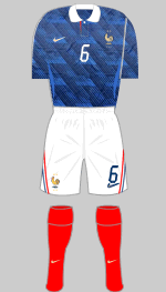
1st
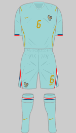
2nd
Designer: Nike
France were runners-up in Qatar and currently top the FIFA rankings. First choice is in the colours of the French flag, as is customary, with an intricate graphic printed into the shirt. On close examination this is made up of the letters FFF (for Fédération Française de Football). The change strip is inspired by the Statue of Liberty, which was gifted to the United States by France 1886 to celebrate the strong ties between the two republics. The colour is that of the verdigris that covers the statue itself. Copper applications and tricolour trim complete the outfit
 Senegal
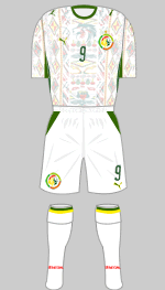
1st
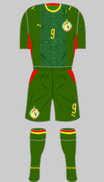
2nd
Designer: Puma
It is a sad state of affairs when the outcome of a major international competition is decided not on the field of play but in a Swiss tribunal. Senegal, who won the Africa Cup of Nations in January and were subsequently stripped of the title have taken their case to the Court of Arbritation for Sport who will make their decision after the World Cup is over.
Once considered one of the weakest sides in Africa, Senegal have made strong progress
in the last 20 years and won the African Nations Championship in 2022. Known as Les Lions de la Téranga, the team's white first choice shirt is decorated with motifs inspired by Cars Rapide, hand painted minibuses that ply their trade in Dakar. The Wild Green change strip has yellow and red applications and an abstract vertical graphic on the front of the shirt.
 Iraq
Iraq
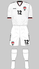
1st
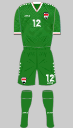
2nd
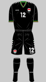
3rd
Designer: Jako
Iraq's kits were revealed in late May and as expected are in all-white with an alternative in green. The black third strip will probably not be needed but will be available for the rest of 2026 and 2027. There is a pattern sublimated into the white and green shirts that is directly inspired by mosaics found in the ancient city of Uruk which is where the earliest examples of writing were found.
 Norway
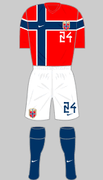
1st
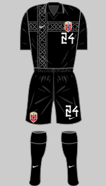
2nd
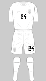
3rd
Designer: Nike
Norway have avoided Nike's new and problematic template in favour of two radical designs that just ooze with Norse identity even down to the runic fonts. The colours of the Norwegian flag are always incorporated into their first choice kit but here it takes centre stage. This is reminiscent of Finland's 2020 Euro strip (also designed by Nike) which incorporated their national flag into the design. When a change is required, Norway have gone full-on Viking with an intimidating all-black strip with tonal applications. For good measure there is also a tonal white third strip.
Group J
 Argentina
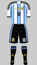
1st
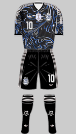
2nd
Designer: Adidas
The World Champions may have slipped to third in the FIFA rankings but they remain a formidable team with their talisman, Lionel Messi set to make his 200th appearance in the finals. They stormed through the CONMEBOL qualifiers finishing top with 38 points, nine clear of the rest of the pack. Adidas' gimmick for the traditional first choice jersey is to grade the stripes from sky blue to dark blue. It has been suggested that having three stripes on the shirt could be a breach of FIFA's rules on branding but no objections have been raised by the kit police. In a break with tradition the shorts, socks and shirt trim are now in a very dark shade of blue ("Night Navy") instead of black. The black change strip is graced by a flowing graphic inspired by the Fileteado Porteño art that is native to Buenos Aires. As both sets have dark shorts and socks white sets will need to be available.
 Algeria
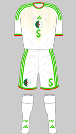
1st
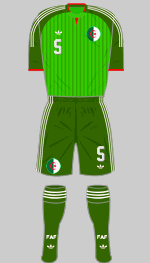
2nd
Designer: Adidas
Algeria are appearing in the finals for the fifth time but have yet to progress beyond the Round of 16. Their record in the Africa Cup of Nations is rather more impressive: they've appeared in the finals 21 times since gaining independence in 1963 and have won the competition twice (1990, 2019). Their white strip features a complicated graphic, fading towards the waist to evoke a desert landscape. The alternative is in three shades of green with white trimmings and red accents but is nothing to write home about.
 Austria
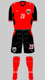
1st
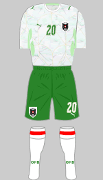
2nd
Designer: Puma
Austria originally wore white shirts with black shorts and socks, changing into red/white/red when required. In 2004 their coach and former star striker, Hans Krankl, decided to switch these around so their "home" colours mirrored the national flag and would differentiate them from their immediate neighbour, Germany. This time out their first choice strip combines both their previous "home and away" styles. Freed from their previous constraints, Puma have gone all-in with a marble effect change shirt matched with deep green shorts and "Mint Melt" trim. According to the children in Puma's marketing department this is inspired by Viennese Kaffeehaus Kultur where passion for the game first began. Really?
 Jordan
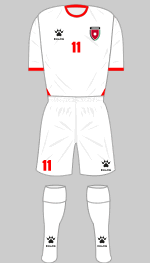
1st
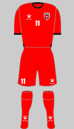
2nd
3rd
Designer: Kelme
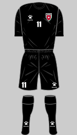
Jordan's national team goes by the splendid nickname of Al Nashama (The Chivalrous Ones) and they are appearing in the finals for the first time. Ranked 63rd they will be looking to give a good account of themselves in a tough group. It turns out that the kits I had earlier added and was so dismissive of were not intended for the World Cup and we now have the real deal. The graphic on the sleeves and shoulders of the first and second choice strips are inspired by the keffiyeh, the square scarf worn throughout the middle-east and a symbol of Palestinian solidarity. The graphic on the black jersey is inspired by the black iris, national flower of Jordan.
Group K
 Portugal
1st
2nd
Designer: Puma
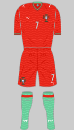
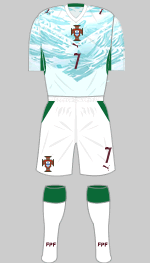
Led by their talisman, Cristiano Ronaldo, Portugal won the Euros in 2016 followed by the European Nations League in 2019 and 2025 but the World Cup has so far eluded them. The team usually wear a shade of deep red that has varied over the years paired with green to reflect the nation's flag. This year the base colour is "Club Red" with a lightish shade of green for the socks and trim. The theme for 2026 is Portugal's long maritime tradition and to this end the red/green outfit has a subtle wave pattern printed into the fabric throughout. A small compass rose appears below the back of the collar. The connection with the sea is more obvious in the change strip with a pale aquamarine shirt featuring a graphic depicting ocean waves. Deep green is used for the trim and the applications are in a very dark red.
 DR Congo
1st
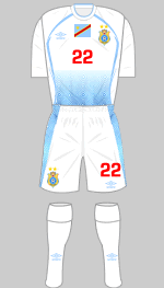
2nd
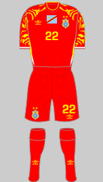
3rd
Designer: Umbro
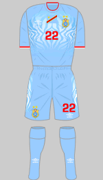
This the second time that the Democratic Republic of Congo have taken part in the World Cup finals since their first appearance in 1974 when they were known as Zaire. They arrive having beaten Jamaica in the Inter-Continental play-offs. With a population of 124 million it is the fourth most populous country in Africa but its abundant mineral wealth has proved a curse. After a brutal period of colonisation, the country has suffered endless rebellions, insurgencies, famine, corruption and foreign invasions since independence in 1960 and is one of the poorest in Africa. Their flamboyant kits are provided by Cheshire based Umbro and held over from last year's AFCON.
 Uzbekistan
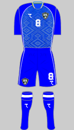
1st
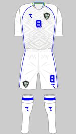
2nd
Designer: 7Saber
Known as The White Wolves, Uzbekistan are appearing in the World Cup Finals for the first time. Since gaining independence after the collapse of the Soviet Union in 1991 the team have established themselves as one of the strongest sides in Central Asia. Local sportswear supplier 7Saber has provided kits in the same template with some killer detailing. The neat collar reproduces the colours of the national flag while the subtle pattern sublimated into the front of the jerseys replicates tiled mosaics found on many of the country's historical monuments.
 Colombia
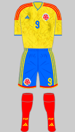
1st
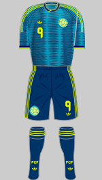
2nd
Designer: Adidas
Colombia are making their seventh appearance in the finals but have yet to get further than the quarter-finals. They have won the Copa América once in 2001, been runners-up twice and finished third five times. While they are a strong side thay are not quite on a par with the very best South American teams. The first kit is in the colours of the Colombian flag and has a delicate pattern woven into the shirt representing yellow butterfly wings. Yellow butterflies were a frequent metaphor in the works of Gabriel Garcia Marquez who died in 2014 and is considered to be Colombia's greatest writer. The change shirt combines two shades of blue teamed with navy shorts and socks as well as brilliant yellow trimmings.
Group L
 England
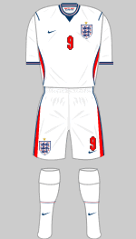
1st
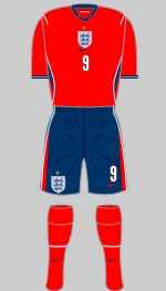
2nd
Designer: Nike
It is now 60 years since England lifted the World Cup for the first and so far only time. Now rated fourth in the FIFA rankings, and handed a relatively easy group, success in 2026 is not out of the question. The team will wear an all-white kit just as they did in Mexico in 1970 when high temperatures were a concern just as they are this year. There's not a lot to say about their kits which are in the latest Nike template. A quotation from the national anthem appears on the inside of the collar, the commemorative star above the three lions is now in gold rather than blending in with the fabric and there's some fine detailing at the collar and cuffs. Not a lot to write home about really.
 Croatia
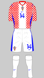
1st
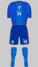
2nd
Designer: Nike
Croatia were runners-up in Russia (2018) and finished third in Qatar four years ago so they are formidable opponents, currently 11th in the FIFA rankings. Their unique checkered shirts were designed in 1990 by Miroslav Šutej, an avant garde painter and graphic artist, when Croatia became independent. The problem for designers of football jerseys is how to find variations on the checkerboard theme that keep the design fresh. Nike have met the challenge head-on by reducing the size of the checks and placing a fading white stripe down the middle that allows the applications to stand out. The other problem is that Croatia's jersey clashes with teams that wear red or white. So, for example, they have been told by FIFA to wear their blue strip against England despite being designated as the "home" team because their first strip clashes with both of England's kits.
 Ghana
Ghana
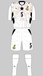
1st
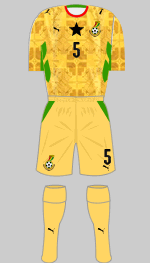
2nd
Designer: Puma
The Black Stars are four times winners of the Africa Cup of Nations but their last win was back in 1982 and they are currently ranked 74th in the world by FIFA. They qualified by topping their relatively weak group six points ahead of Madagascar. Traditionally the team wear white with trimmings in the national colours and the eponymous black star that features in the national flag. This time round the jersey boasts intercepting lines that evoke traditional Kente cloth. The alternative is in "Sunny Yellow" with an overall graphic in a deeper shade of gold that represents elements of the famous Makola Market in the capital, Accra. Good as these jerseys are, I think Puma are stretching the cultural connections a bit too far.
 Panama
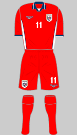
1st
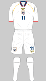
2nd
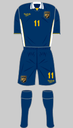
3rd
Designer: Reebok
Panama have been here before and scored their first goal in the finals against (whisper this softly) England in 2018. Ranked 33rd by FIFA they are unlikely to trouble the later stages of these finals. It's good to see the Reebok brand back in the limelight and they have served up three workmanlike strips in red, white and dark blue with no gimmicks. Refreshing that.
 In 2016, as part of his campaign for the FIFA presidency Gianni Infantino proposed expanding the World Cup from 32 to 48 teams. Opponents argued that the competition was already too big and enlarging it further would only dilute the quality. Critics suggested Infantino's motives were political and aimed at securing his own position within FIFA rather than being in the interests of the game.