A History of Football Kit Design in England and Scotland
(10) The Technology of Polyester (2000-2009)
More Than Just Plastic
At the start of the new millennium the focus shifted away from the extravagant printed designs of the previous decade and focussed more on improving performance. The impetus for this change began when Nike became technical sponsor to the Brazilian national team in 1996 and tasked their designers with finding ways to enhance the performance of elite athletes.
Football jerseys in the 1990s were made from classic polyester fibres but in 1998 Nike introduced their Dri-FIT fabric which was made from polyester microfibres with a fineness of 0.5-1.0 denier or 15-30 times thinner than a human hair. This fabric was light, very soft, had excellent water absorption properties and started an arms race between the major sportswear suppliers.
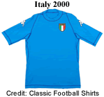 Among the first to exploit the new fabric technology was Kappa who, in 2000, launched their Kombat range which was provided to the Italian national team. This was innovative not just because of the use of novel, highly elastic fabric but for its skin-tight fit. This was intended to reduce shirt pulling, which had risen to epidemic levels when baggy shirts were all the rage. It also featured reversed seams designed to reduce chafing. It furthermore emphasised the physique of the wearer (so not too popular with fans whose diet included much consumption of pies) but was not universally popular with players, many of whom wore jerseys two sizes larger.
  Nevertheless the Kombat range had a lasting impressions on designers who gradually introduced more slim line jerseys and is still in production.
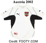
In 2002 Puma launched their own version which featured deep panels under the arm and down the side of the body. These were made from a lighter material intended to improve ventilation around the core. Puma also featured reversed seams although these were in quite different places and may well have purely decorative.
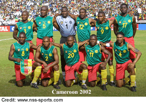 Puma had developed a strong relationship with several of the leading African Football Federations including Cameroon for whom they designed revolutionary sleeveless jerseys for their successful defence of the 2002 Africa Cup of Nations. When FIFA caught wind of Cameroon's intention to wear this innovative strip in Japan and Korea horrified Fifa spokesman Keith Cooper said "they're not shirts...they're vests" and banned them until the team had black t-shirt sleeves sewn in.
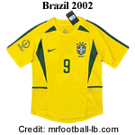 Ahead of the 2002 World Cup, which would be played in the hot and humid summer conditions of South Korea and Japan, Nike's boffins turned their attention to how they would keep the Seleção Brasileira cool and dry. The solution they came up with was, with hindsight, somewhat over
 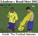 complicated. The template, which was worn by every team that Nike sponsored in the finals had various panels in lighter fabric that were perforated to improve ventilation. In addition these shirts came with a tightly fitting underlayer that would wick sweat away from the players' body into the ventilated area. All well and good in theory but the two layers were not properly attached to each other and when
  players celebrated a goal by taking off their shirt it could all go terribly wrong. Evidently this technology would not survive long.
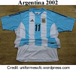
Adidas introduced their own version of the double shirt under the Clima Cool brand. The two layers were firmly attached so could be more readily removed and put back on. Of course these days taking off your shirt during a match will earn you a yellow 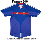 card so it's not so much of a problem.
In 2003 Adidas solved the problem of detached shirts by combining the two layers into one and the following year they introduced a new template in which the ventilated panels were larger than the base fabric.
2004 was when the Africa Cup of Nations would be played out ahead of the World Cup and once again Puma and the Cameroon Football Federation decided to pull FIFA's 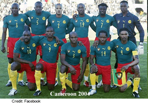 tail. Puma designed a kind of onesey in which the jersey and shorts were combined into a single garment although no one has yet explained how you put it on. This drove FIFA's General Secretary Sepp Blatter into a rage. “It goes against the laws of the game. The rules are very clear, there is one shirt, one shorts and one socks*. They cannot do it. You cannot play a game against the laws of the game. We are the guardians of the laws of the game – the laws are universal**.” Faced with
 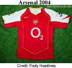 huge fines and World Cup qualifying points deductions the CFF backed down and the oneseys were replaced.
(* Two socks surely.)
(**So suck that up Alpha Centauri!)
 The next generation of Nike kits introduced in 2004 also dispensed with the two layer approach and only the centre of the torso and the shoulders had closed fabric, the remainder of the jersey being a lighter mesh to promote breathabilty.
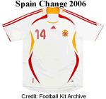
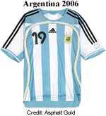 Adidas now completely abandoned the two layer approach with the next generation of the Clima Cool range. The different zones were often outlined with elegant flashes as seen here in Spain's 2006 change shirt. While this required some design compromises on shirts with stripes or other traditional designs, Adidas'
  designers responded well to the challenge.
Puma's response to all this was both simple and high-tech. Instead of sewing the two layers together Puma employed laser bonding tech. Of course to the consumer and the players this innovation meant nothing but to the highly competitive designers in the big three sportswear providers, this was Star Wars v Dungeons & Dragons.
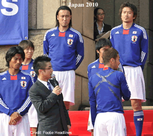 The 2010 World Cup finals held in South Africa yielded one novel surprise that at first sight was bewildering. Teams wearing Adidas kit had a strange, slightly reflective pattern that criss crossed the player's backs. This it turned out, was Adidas' secret weapon, otherwise known as the Adidas TechFit PowerWeb technology. Adidas claimed this was a cutting edge athletic apparel technology that improves muscular endurance and responsiveness, and reduces muscle vibration, ultimately maximizing the athlete’s performance. Through the use of compression fabrics and strategically placed TPU (Thermoplastic Urethane) bands, located in key areas to enhance muscle power, TechFit is proven to increase a player’s power by 5.3 percent*, vertical leap by 4 percent*, sprint speed by 1.1 percent* and enhance endurance by 0.8 percent*.
Yeah-pull the other one.
So the burning question at the end of this section is did all this competitive technology achieve anything? In the absence of any empirical data the answer has to be probably not if we are looking at improved athlete performance. Advances in sports science, coaching techniques, nutrition and fitness levels would surely have outweighed the very marginal advantages associated with wearing one company's polyester over that of another.
What we can say is that the competition generated fuelled the growth of the big three sportswear providers, Adidas, Puma and Nike and positioned them to dominate the global market going forward.
This section draws heavily on the research undertaken by long term friend of HFK Gabriel Vogas and previously published on his website Uniformes Cultura FC. The site is in Brazilian Portuguese but with the help of Google Translate it can be accessed by Anglophones. Vá dar uma olhada.
Assymmetrical Style
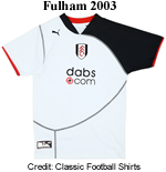 From time immemorial football shirts had been symmetrical. If you had contrasting sleeves they would match. Striped jerseys should have the same number of stripes on each side and on the back (a rule that Newcastle United broke in the 90s and didn't
  they look awful). Occasionally a team would sport a stripe or two on one side of their shirts but these were vanishingly rare. There were of course other examples, especially in the 90s but by and large one side of a kit matched the other side. In 2003 however Puma and Fulham launched the first truly assymmetrical shirt and it caused a sensation.
In 2005-06 Ipswich Town produced their own take on the new style under their in-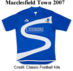 house Punch brand. The sweeping graphic was repeated in blue on the shorts. Humble Macclesfield Town got into the act in 2007 with a very attractive jersey on which the stylised "S" represented not only their nickname (The
 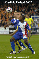 Silk Men) but also a skein of silk.
Carlisle United's strip from 2007-08 is an outstanding example of how to make an assymmetric kit work by integrating the flowing graphic on the jersey into the shorts while incorporating the club's red accent colour into the design.
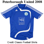 All of the examples shown here were one-off kits created for specific clubs rather than becoming templates in a catalogue. Adidas, however, decided to add an assymmetric design to their 2008-09 catalogue which was picked up by a few clubs in the lower divisions. Their effort manages to look both pedestrian and ugly and it's no surprise that it was soon dropped.
Reversed Seams
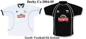 We have already touched on the trend for reversed seams and readers pf previous chapters in this series will recall that Patrick Sportswear had introduced the concept in the Eighties. Now they appeared everywhere and were often purely decorative rather than integral to the way the shirt was constructed. Errea's shirts for Derby County, for
  example, both have seams but they follow different paths on the first choice and change shirt.
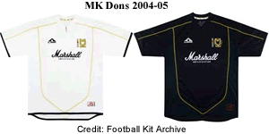
MK Dons, on the other hand, preferred their main and alternative kits to be made using the same template which 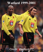 contributes to a more consistent visual identity and just looks more professional.
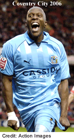 This example of Watford's Le Coq Sportif kit from the beginning of the decade is rather busy with black piping on the body, red on the sleeves and lots of detailing at the collar, cuffs and shorts. Contrast this with Puma's subtle design for Coventry City some seven years later. Here the piping serves to separate the (matt) raglan sleeves from the (shiny) shadow stripes on the torso. Unlike the previous example this detail is both decorative and functional.
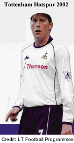 Kappa's Kombat range continued to appear retaining the reversed seams that they created but now with a rather looser fit as shown in this example from 2002-03 worn by Tottenham Hotspur.
Burnley's kit from 2007-08, designed by Errea, illustrates how designs were becaming much simpler. The plain V neck and cuffs have a distinctly retro feel and stand out 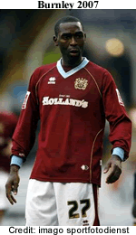 beautifully from the plain claret jersey while the sponsor is a quintessentially Lancashire purveyor of pies. The killer detail, however is the subtle gold piping that outlines the raglan sleeve and reappears on the lower torso. This strip, produced for the club's 125th anniversary reminds us that simplicity and understatement are key to producing a memorable football jersey.
In 2006 Adidas won back the important kit sponsorship deal 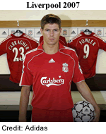 with Liverpool that they had lost a decade earlier. Obviously the new kits would feature Adidas' signature three stripe trim but something else would be needed if their debut outfit was to have an impact. The solution they came up with was to add piping that flowed downwards from the front of the collar flaps, describing a gently sinuous path down the side of the torso. This may not have been ground breaking but it was certainly eye-catching and the first time I saw someone wearing a replica (on Bridgend Station as it happens) I thought, "Now that's interesting."
Simpler Designs with Extras
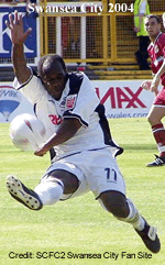 The trend throughout the decade was away from the flashy excesses of the 90s towards simpler designs that emphasised function rather than appearance. The complex sublimated patterns that had dominated during the previous decade now disappeared. Nike led the way with their self coloured and striped templates but
 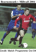 there was no smooth transition from complexity to simplicity. On the contrary, manufacturers now started to compete on the basis of the extra flashes, stripes and panels they could work into their designs.
For example, in 2004-05 Swansea City added broad black stripes to the shoulders, sleeves and the side of their jerseys. AFC Bournemouth added black side panels to their jerseys that continued down the inside sleeve while Millwall (in blue) had a broad white stripe on the outside sleeve (but not on the shoulder) and white trim across the front of their flappy collars. All of 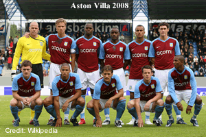 these features in various combinations became very common
 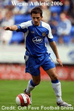 over the decade.
Contrasting raglan sleeves were very popular during the period and could be succesfuly combined with jerseys that were plain, striped, hooped, halved or quartered. They came in a variety of flavours. The scooped versions sported by Aston Villa had a profound curve running across the shoulder and down to the armpit. Wigan Athletic wore a different style that had a 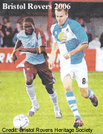 more gentle transition from shoulder to armpit seam.
The Bristol Rovers kit from 2006-07, designed by Errea, shows how raglan sleeves work well with quartered shirts. Once again we see that 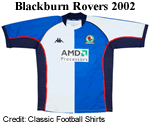 simplicity is the key to a memorable kit. By way of contrast consider Kappa's 2002-03 design for Blackburn Rovers. The sleeves look great but the addition of dark navy side panels, collar and cuffs plus red piping makes the shirt look too busy. It also breaks one of the cardinal rules of football shirt desiogn, which is to incorporate no more than three colours.
Retro and One-Offs
Many clubs celebrated important anniversaries during the 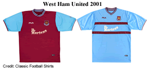 decade and began to look at their kit back catalogue for inspiration, a process that as often as not began with poking around on this website. West Ham United commissioned their kit supplier, Fila, to come up with first and second strips based on the iconic shirts worn by their World Cup heroes in the mid Sixties. To my mind, and allowing for the need to incorporate shirt advertising, these don't quite work. In part this is because Fila have incorporated modern design
  flourishes into the jerseys such as the fold over collar on the first choice jersey and the bands on the change that just don't match the splendour of the originals. A good effort but could do better.
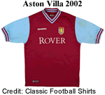
Aston Villa's elegant 2002-03 strip illustrates the point. This was produced by Diadora and was based on the strips worn in the early Sixties and is a pretty faithful reproduction of the original. Even the sponsor's logo written in Times New Roman looks right.
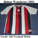 The 2002-03 season also marked the 125th Anniversary of Bolton Wanderers and the club commissioned a limited edition of 1,000 numbered special shirts that were sold to supporters. The shirts were worn once by the team. Curiously they are modelled on the striped tops worn by the team in 1885-86 but were far more eye catching than the plain salmon pink jerseys that were worn 100 years previously.
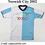 In 2002-03 Norwich City celebrated their centenary and to mark the occasion they commissioned Xara to supply light blue and white halved jerseys that were modelled on their very first colours, to be worn as a change strip. The resemblance to Blackburn Rovers early kit is not a coincidence. When Frederick Gayton returned to his native Norwich after plying his trade as a cobbler in Blackburn, where he supplemented his income by playing for Rovers, he persuaded some of his fellow players to join him and they all brought their football shirts with them and these became the team's official colours.
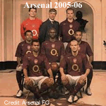 In 2005-06 Arsenal introduced dark redcurrant jerseys for their last season at Highbury claiming that these were the colours worn by the team when they moved from Plumstead to Highbury in 1913. A colourised photograph of the 1913 team wearing dark red jerseys was used in the publicity. All of this was entirely false and the photograph itself was colourised as part of the modern marketing campaign. It is true that contemporary photographs of the team do suggest their shirts were very
  dark but HFK was able to establish this was an artifact of the photographic emulsions in use at the time which were oversensitive to red light which appear overexposed. Research into primary sources by Mark Andrews and Andy Kelly has proved conclusively that Arsenal have always worn bright red jerseys.
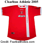
In 2005-06 Charlton Athletic followed the example of Bolton Wanderers by producing a special limited edition kit to mark their centenary. This appeared on the pitch in October 2005.
The Kit Suppliers
Nike
 The decade began with the announcement that Nike had signed a world record contract with Manchester United worth £302.9 milliion over 15 years to supply the team's kit to run from 2002-03 when Umbro's contract expired. It should not be imagined for a moment that Nike planned to recoup this outlay through replica kit sales. This was part of Nike's plan to became a global brand by attaching themselves to a football club with an international following. Their logo and products would be
  getting massive exposure through television in all of the key markets that they wanted to target.
These days we are used to seeing the logos of the big three sportswear suppliers, Nike, Adidas and Puma at every level of the Premier and Football Leagues but in 2000-01 they were far from pre-eminent and between them they accounted for just eleven of the 92 member clubs.
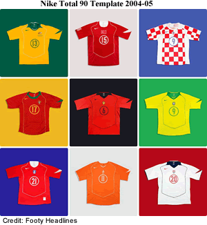
There was little to distinguish Nike's kits early in the decade from those of the competition but in 2004-05 they introduced the Total 90 template which was used for almost all of the important kits for clubs and national teams. The use of a generic template ensured that every team that wore it could be recognised as having been kitted out by Nike and to hammer the point home, they even included a giant "swoosh" on the 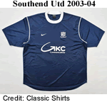 left sleeve. Critics described the notion of standard templates as boring but failed to appreciate the scale of Nike's ambition.
Around 2003-04 Nike introduced their Park template. Conceived as a back-to-basics no frills kit for grass roots clubs. The design would be updated each 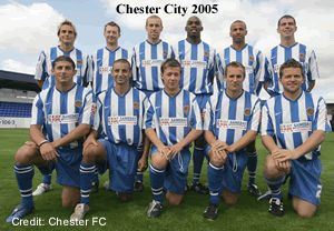 season with some minor tweaks. Southend United wore Nike templates between 2003 and 2020 based on this design. Nike also introduced no-frills versions of their striped jerseys such as this one worn by Chester City in 2005-06. Variants were produced each season with wider or
  narrower stripes to keep things fresh.
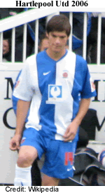
One of the odder variations on the striped jersey theme was worn by Hartlepool United in 2006-08, a sort of hybrid between broad stripes and half-and-half.
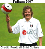 The final innovation featured here is what we might call Nike's ghosted half-and-half jersey that appeared in 2007-08 and was adopted by several teams. The important feature is that the halves are shaded so subtly that the difference is almost imperceptible. That being so one might ask so what's the point? To ask the question is, if you'll forgive me, to miss the point. The jerseys are designed to appear like Fulham's traditional white shirt and black shorts combination on the pitch. It's only when you meet your mates in the pub after the match that this telling detail reveals that you are wearing the latest gear and not last season's old tat.
Nike's impact on kit design over the decade was significant. They introduced the concept of template kits and changed the design ethic away from complexity towards simplicity and we should thank them for that.
Adidas
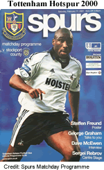 After the disastrous Adidas Equipment fiasco of the mid Nineties, Adidas had struggled to re-establish themselves in the UK. In 2000 they had just three clubs under contract but at least these were in the top flight: Spurs, Newcastle Utd and Fulham. The Spurs outfit featured the standard Adidas three-stripe trim, added
  navy piping on the jersey and placed the trim inside a broad white stripe on the shorts. It all looks a bit busy.
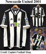
Adidas worked hard to keep Newcastle Utd onside, retaining the contract until the end of the decade. This effort from 2001-02 is one of their more interesting contributions.
Over the course of the decade Adidas added Liverpool, Chelsea and Derby County to their roster although they lost the Tottenham Hotspur contract to Kappa in 2002. Their design for Chelsea in 2008-09 was probably the best of the bunch, relying on the traditional 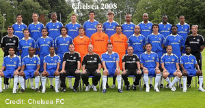 combination of blue shirts and shorts with white socks plus Adidas' trademark trim: no piping or other complications aside from a flash of gold at the collar and cuffs. Once again, and I know I am labouring the point, simplicity trumps complexity.
In the Nineties Adidas had seen their market share in the United States devastated by the aggressive policies of Nike and Reebok. In 2004 they seized upon an opportunity to 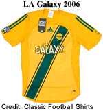 redress the balance when they won the contract to supply kit to Major League Soccer, the highest professional league in the United States. The MLS operates on the American single franchise model so Adidas negotiated its contract with the league itself rather than the individual franchised teams. This may have been seen as a risky investment at the time but as the league expanded and popularity (and TV exposure)grew, the German company had certainly picked a winner and their contract was recently renewed to run until 2030 at an annual cost of $138 million (£103 million).
Puma
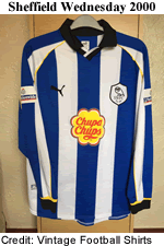 Puma were in much the same position as their bitter rivals Adidas and Nike with just four clubs on their books at the start of the decade. These included Sheffield Wednesday who had worn Puma since 1993 but whose contract was about to run out. There was nothing particularly distinctive about Puma's shirts during this period
 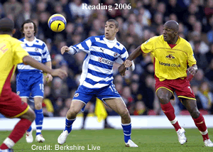 apart from the leaping cat trademark. Their designs were generally speaking functional and without excessive detaiiing so they fitted well into the prevailing trend towards simpler designs.
Over the course of the decade Puma steadily built up its roster. Reading signed up in 2004 and while their first couple of kits were 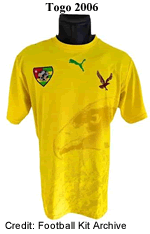 pretty standard the 2006-08 outfit was rather more radical.
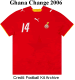
Puma made quite an impact on the 2006 FIFA World Cup providing kits to 11 of the 36 competing nations and all five of 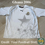 the African nations that had qualified. For these Puma designed bespoke kits that featured a sublimated image on the shirts to represent something of the culture and history of each nation. For Togo this was the head of an eagle, Ghana's shirts bore a faint image of the black star from their flag (and the nickname of the team), Cote d'Ivoire had a banyan tree and Tunisia had an eagle in flight. These innovative designs reintroduced image sublimation into designers' tool box and further cemented Puma's relationship with African nations.
Unlike Adidas and to some extent Nike, Puma lacked any distinctive feature that would make their products stand out but they were working on it.
Umbro
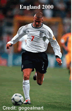 Formed in 1924 Umbro had become the archetypal British football kit supplier but they lacked the financial muscle and product range of the big three and were in
 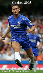 danger of being marginalised. The loss of the lucrative contract with Manchester United from 2002 was a blow but they still had Chelsea, Everton and Manchester City on the books as well as the very profitable contracts with the FA and SFA to provide kit to the English and Scottish national teams. They were now completely absent from the lower divisions.
The outfits they provided were perfectly adequate and in keeping with the times. After Chelsea won the Premier League title in 2005 Umbro added some discrete gold flashes to their kit for the following season. After they won the title again in 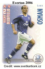 2005-06 Adidas swooped in with a eight-year contract deal worth £12 million a year that was later extended for two more seasons.
In 2006 the wheels started to come off in Umbro's design office. It began with a peculiar design for Everton that featured a white crew neck that broke off on the right hand side where two white diamonds were placed on the top shoulder seam. Taken in isolation this could be forgiven as an aberration but the following year Umbro introduced a new template that defied belief.
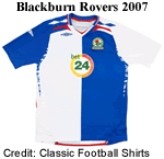 On a plain jersey one could just about get away with this but on Blackburn Rovers' iconic halved shirts the results were less than optimal. We have reversed raglan sleeves which complicate matters from the start. A pair of diamonds are reversed out on each shoulder below which are two red flashes. There's the Umbro double diamond trademark hoisted up below a complicated collar and another for good measure on the right hand sleeve. Had enough? Not on your Nelly! To cap it all there is an
  incomprehensible mesh panel running down the side of the torso and part way up the shoulder seam. The shorts had equally baffling trim consisting of diamonds and blue piping but I am going to spare you this. This was simply a mess and should never have been approved. Only a few clubs opted to wear the template which was quietly put to sleep at the end of the season.
In October 2007 Nike announced that it had bought out Umbro for £285 million, the equivalent of 193p per share. As Umbro's shares were trading at 130p at the time the board recommended that shareholders accept the bid. The regulators gave their approval in December 2007 and the deal was completed in February 2008. One of the first actions taken by the new owners was to put in their own design team and the fruits of their labours would be revealed in 2009-10.
Bukta
 The world's oldest sportswear manufacturer had been struggling for years and in 1982 the family that had run the company since 1879 sold their interest to a group led by Sir Hugh Fraser of the Fraser Group. This failed to reverse the decline and in
  the early Nineties Bukta folded.
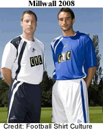
In 2005 the Bukta brand was relaunched after a six year hiatus now targeting up-market independent retail outlets. It is unclear how this related to their business supplying football kit but by 2008-09 they had only two Football League clubs on their books, Millwall and Chesterfield who wore variations of the same template. Bukta lost these contracts in 2009-10.
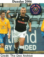
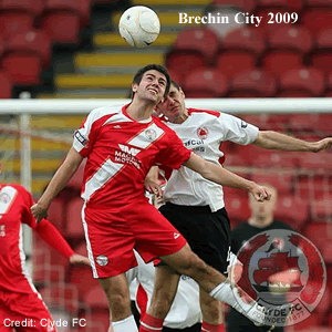 Bukta had a toe hold in Scotland and supplied Dundee, now in the second tier. They also had Brechin City and Forfar Athletic on their books, minnows by any standards. The kits Bukta delivered for these teams were actually pretty good: the Hedgemen of Brechin got an all-red outfit with a diagonal white sash which was both original and attractive although there was rather too much in the way of trim.
The Loons received a strip in blue and black that recalled their colours at the beginning of the 20th century which should have engaged the interest of anyone with knowledge of the club's early history.
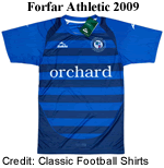 Something, however, went very badly wrong and in October 2009 both clubs applied to the Scottish Football League for permission to change their kit suppliers and colours. This is a highly unusual state of affairs and suggests that either Bukta failed to supply the required number of kits or that the quality was unacceptable. When I contacted their Press Officer she refused to be drawn on why the contracts had been cancelled and assured me that Bukta would soon be back. Bukta's venture into fashion wear appears to have failed and the name faded into obscurity. The Bukta brand is now owned by a private limited company that was registered as dormant with HMRC in 2025. The contracts passed to West Yorkshire company Pendle Sportswear who were able to supply both clubs from stock (which explains the request to change colours).
Bukta's contract with Dundee lapsed at the end of the 2009-10 season and that was that for the world's oldest sportswear company.
Le Coq Sportif
The French company had appeared in the UK in the Eighties when they supplied Tottenham Hotspur with some of their most iconic strips. During the 1990s and 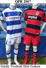 early 2000s the company had become embroiled in a series of scandals and financial
  problems. At one stage it was taken over by Oliver Jacques who was later imprisoned for counterfeiting Adidas and Nike products. He thus became the second chairman of the company to wind up in jail after Bernard Tapie.
Le Coq Sportif survived and was relaunched in 2005 by Robert Louis-Dreyfus. They had been supplying kit prior to this event, notably to Queen's Park Rangers who had been wearing LCS kit since 1997.
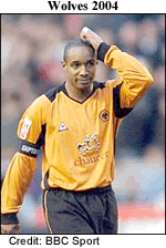
Wolverhampton Wanderers returned to the Le Coq Sportif's fold in 2004 and wore their kit until 2010.
Errea
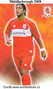 The Italian company, based in Parma, had been present in the UK since 1995-96 when they started to provide Middlesbrough's kit and would do so until 2008-09. Generally they played it safe after 2000 staying with the fans' favourites, either all-red or red with the white chest band Jack Charlton introduced in the Seventies. Naturally Errea's submissions had modern flourishes such as the 2008 jersey where the hoop flows into the piping on the left.
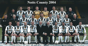 Although Errea generally produced elegant designs there were occasions when good sense seemed to desert the design team and they would come up with a shocker. This example, modeled by the Notts County team is from Errea's 2004-05 catalogue and was also adoped by Elgin City.
Patrick
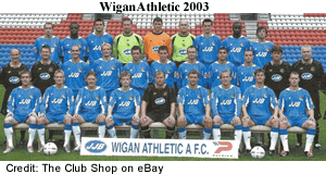 In 2002 Dave Whelan, chairman of Wigan Athletic bought a stake in the Belgian sportswear company and sold Patrick
  products in his JJB stores across the UK under the JJB own-brand umbrella. Naturally Patrick kitted out the Latics who, at the time, wore JJB's corporate colours of mid-blue, white and light green. Wigan Warriors, the town's famous Rugby League side, which Whelan also owned, also wore Patrick kit.
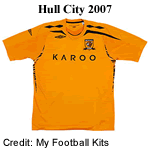
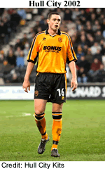
Patrick supplied several clubs in the Football League during the decade among whom was Hull City. While this 2002-03 shirt is not unusual for the period, featuring a stripe down the shoulder and sleeves, side panels and flappy collar with V neck, subtle white piping has been added to separate the amber and black elements which is a nice touch.
Reebok
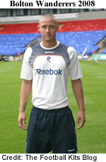 Although the American sports and leisurewear giant did not have a large portfolio of English clubs it did sponsor three top level teams, Liverpool, Manchester City and Bolton Wanderers. City wore Reebok for just four seasons, Liverpool ten but Bolton were with Reebok for a remarkable 19 seasons. Not only did they display the company's logotype on their shirts in its various iterations, they also sold the naming rights for their stadium to the US company and between 1997 and 2014 the Trotters played in The Reebok Stadium.
In 2005 Adidas bought Reebok for a reported $3.8 billion (£2.84 billion) in order to better compete with Nike although the two brands retained their separate identities.
Towards the end of the decade Reebok shifted its focus to American elite sport and fashion.
The New Kids on the Block
 None of the sportswear suppliers reviewed so far had more than a handful of clubs on their books. Thirteen clubs wore their own brands while the rest took up with smaller and local suppliers. A number of brands cropped up in the lower divisions, appearing as if from nowhere and then disappearing.
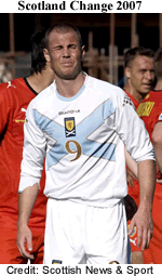
Diadora was an Italian sports and footwear manufacturer based in Veneto province, in north eastern Italy. In the early 1980s their shoes were considered a status symbol in the casual clothing culture favoured by British football hooligans. In the Nineties they began to supply kit to Italian football clubs and in 2003 they won the contract to supply the Scottish national side. The change strip they produced for 2007-08 was absolutely outstanding. Playing on patriotic 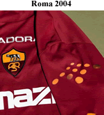 themes with a reversed St Andrew's Cross in pale blue and edged in dark gold this remains a favourite.
A detail that is easy to overlook in the Scottish photograph but which clearer in this image of Roma's 2004-05 shirt is the arrow head shaped pattern of sports that are placed at the top of the sleeves. 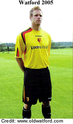 These changed colour as the player's body temperature rose: it is hard to imagine an innovation that is more useless until we learn that some jerseys also had self-coloured rubberised spots on the front to help the player control the ball with his chest.
One final innovation that Diadora left behind was the vertical trim in two colours that appeared above the cuffs, on the side of the shorts and on the socks. In the case of Watford this featured on right hand side only whereas West Bromwich Albion had the trimings on both sides of their kit.
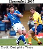 Lotto is another Italian company, founded in 1939 in Montebelluna, also in the Veneto province. Since the region is a world hub for footwear manufacture this is how they started, expanding in the Seventies into footwear for tennis, volleyball, basketball, athletics and football. In the Eighties Lotto expanded operations and began to sign up well known sports personalities to endorse their products and provide input into their design. In 2007 Lotto started to supply Swindon Town and Chesterfield as well as three Scottish clubs with strips in their own, very distinctive template. This also turned up in the kit hampers of Serbia & Montenegro and Costa Rica.
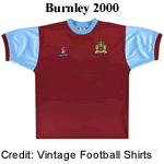 In the late Nineties and the first couple of years of the 21st century a company called Super League provided kit to around seven lower ranking clubs in England. I have found no details of the company onine although Companies House lists a company of this name that was based in Leeds, was incorporated in 1992 and wound up in 2013. Among the kits they supplied was a superb recreation of Burnley's Sixties strip in 2000-01
 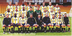 which was worn with plain white shorts and socks with claret and blue rings on the turnover, exactly like the original. The effect was made even more authentic because for all but the last two months of the season, there was no shirt sponsor. Although most of the clubs Super League supported were in the north of England, there was one outlier. Torquay United commissioned the company to provide a replica of the very popular Matchwinner outfit from 1991.The unusual combination of yellow and white stripes set off by navy trimmings and shorts was ground breaking and looked just as good ten years on.
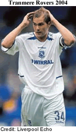 Vandanel was formed in 1984 in London by father and son team, Graham and Neil Burke. They started out producing leisurewear for London based football clubs before branching out into football kits, focussing mainly on the lower divisions. The first kit they designed for Tranmere Rovers is fairly typical, staying true to Rovers' all-white theme and adding blue trimmings here and there.
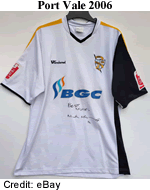 This shirt for Port Vale plays with the popular assymmetric concept and incorporates Vale's amber accent colour, a throwback to the 1958-63 period when amber and black were their main colours. It was worn with traditional black shorts. Similar assymmetric tops turned up at Northampton Town and Tranmere Rovers.
Vandanel only once sponsored a club in the top flight and that was Wigan Athletic in 2009-10. Shortly afterwards the company ran into financial problems and was voluntarily liquidated in 2012.
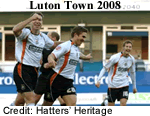 Carbrini Sportswear was an affordable sportswear and lifestyle brand owned by JD Sports who sold their products on an exclusive basis through their chain of stores from 2006.Towards the end of the decade they began to provide kit to a few clubs in the lower reaches of the Football League such as Luton Town. The flowing trim and piping on the front of their shirts was something of a theme but each team got their own style. While they made little impact in this
  decade they would become a highly visible brand in the next.
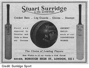
Stuart Surridge Co Ltd came into existence in 1867 to manufacture cricket bats. WG Grace favoured the Surridge bat and this remained the core of the company's business as it passed from father to son down the generations. In 1958 Stuart Surridge, grandson of the founder invented the first synthetic laceless football, the Surridge Cobbler, which was chosen as the match ball for the 1958 World Cup. In the Sixties and Seventies the company diversified into the manufacture of track suits and athletic footwear. Following 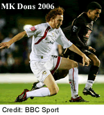 Stuart Srridge's death in 1992 his family decided to sell the business to Dunlop-
 Slazenger. In 2005 the brand was bought by the SDL Group Ltd and rebranded as Surridge Sport.
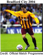
Surridge claims that it created its first football kit for MK Dons in 2006-07. However, according to my own records their debut came two years earlier in October 2004 after Bradford City cancelled their contract with Diadora and commissioned Surridge instead. The decision to add an amber yoke and solid amber sleeves was a brave one but it worked and Surridge remained the Bantam's supplier of choice through the decade while they rummaged through the archive to create modern versions of some old favourites.
Surriidge also proved popular in Scotland and they added Queen of the South, St Johnstone, Airdrie United, Clyde, Ayr United and Dumbarton to the order book before the end of the decade.
It was now normal for clubs in the lower levels to receive their playing kit as part of a sponsorship deal with the supplier rather than buying it. Considerations might include a percentage of retail sales, free advertising aound the ground and in the club programme. The suppliers logo would also appear in coverage by the local press. Clubs might have to pay for special, one-off jerseys if they could not find a sponsor for a special event and players who gave their shirts away might have to pay for a replacement.
© Dave Moor July 2026